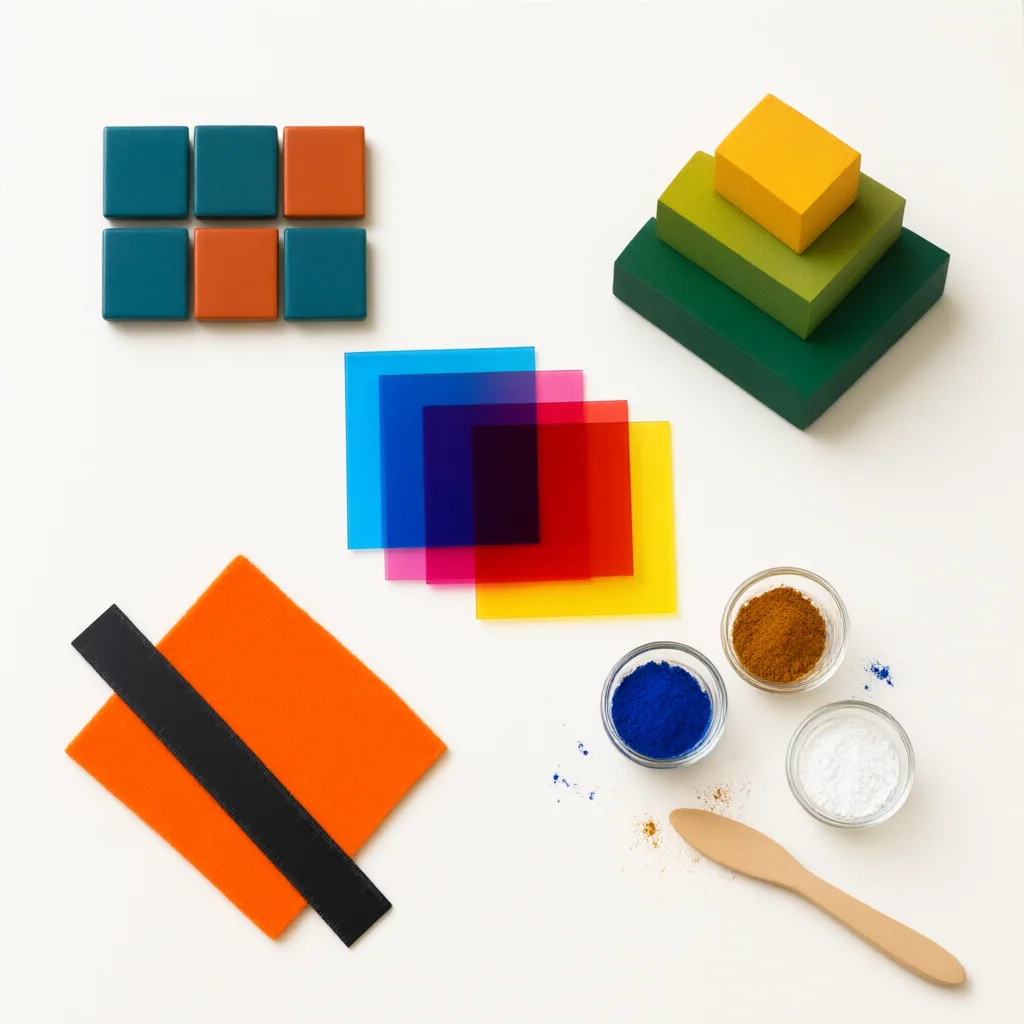
Color choices shape how a page feels before a reader processes a single word. For designers, photographers, educators, and anyone building visual material, the color wheel is a practical map: it helps you predict contrast, organize emphasis, and keep a composition readable across print and screens.
What the color wheel actually helps you do
The color wheel arranges hues so relationships become visible instead of intuitive guesswork. Neighboring hues tend to feel smooth together, while hues across the wheel create tension and energy. That matters when you are deciding whether a poster needs calm continuity, a dashboard needs clear hierarchy, or an illustration needs stronger visual separation.
A useful way to read the wheel is to think in three layers. Hue identifies the color family. Saturation describes intensity, from muted to vivid. Value describes lightness and darkness. Many design problems are not caused by the wrong hue alone, but by poor control of saturation and value. Two colors can look different in theory yet still fail in practice if they share the same brightness and collapse into each other.
Common color relationships in real work
Complementary pairs sit opposite each other on the wheel and create strong contrast. They are effective for focal points, calls to action, and elements that must stand apart. The tradeoff is that full-strength complements can feel harsh, so many layouts work better when one color leads and the opposite color appears in smaller accents.
Analogous schemes use neighboring hues. They are often easier to control in editorial graphics, interface backgrounds, and image-led layouts because they create continuity without looking flat. Triadic schemes spread attention across three evenly spaced hues and can feel lively, but they require discipline in proportion so the page does not become noisy.
Monochromatic palettes are sometimes underestimated. Working within one hue family while shifting value and saturation can produce a clean, technical, or documentary tone. This is especially useful when diagrams, captions, and side notes need to stay organized without competing for attention.
Contrast matters more than novelty
A color palette is only successful if readers can use it. High hue variety does not guarantee clarity; usable contrast comes from differences in value, scale, and placement. Dark text on a light background remains one of the safest defaults for long reading, while strong accent colors work best when they guide attention rather than flood the page.
This is also where accessibility becomes part of color theory, not an afterthought. If two interface states are distinguished only by color, some readers will miss the difference. Labels, icons, patterns, or spacing can carry the same meaning more reliably. In charts and diagrams, separating categories with both hue and lightness makes the information easier to decode.
Applying the wheel without making work look formulaic
The color wheel is a guide, not a machine for generating finished design. Start with the purpose of the piece: instruction, persuasion, navigation, or atmosphere. Then choose one dominant color role, one supporting role, and one emphasis role. Test the palette in context with type, imagery, and small interface elements, because colors that look balanced in swatches often behave differently in a full layout.
For photography and digital publishing, the same principle holds. Warm and cool relationships can direct mood, but local contrast and tonal structure usually decide whether an image feels coherent. If a composition is failing, adjusting value balance is often more effective than adding more colors.
The strongest use of color theory is quiet competence. When the wheel is used well, readers notice clarity, rhythm, and emphasis before they notice the palette itself.