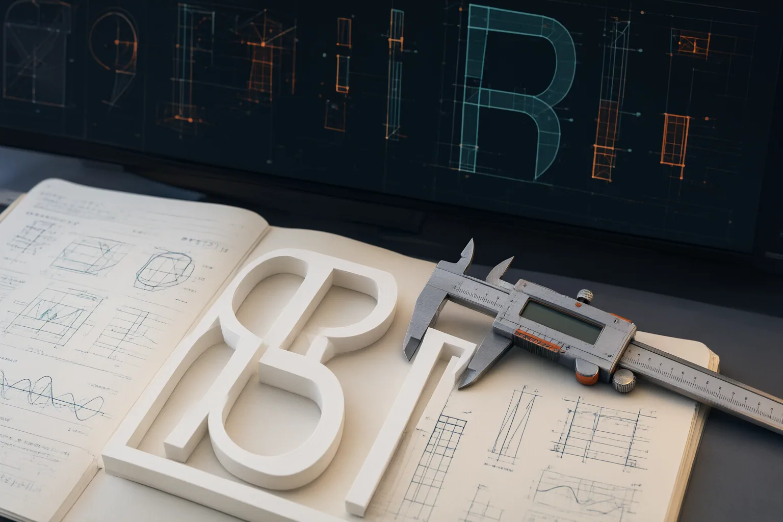
For readable long-form screen text, favor distinct letterforms, open shapes, balanced strokes, moderate contrast, and comfortable spacing. Then test representative passages at actual body-text sizes on both desktop and mobile rather than judging a font from a headline or large preview.
Start With Clear, Distinct Letterforms
Begin by examining characters that readers could easily confuse. Practical guidance from Get Studio and Fontiverse favors typefaces with clearly differentiated letterforms, open counters, and recognizable shapes. These qualities can make individual characters easier to resolve when text is displayed at body-copy sizes.
Stroke construction also matters. Upright forms, balanced strokes, and moderate contrast are generally safer starting points than extremely thin details. Thin strokes may lose clarity at smaller sizes, while cramped counters can make letters appear less distinct. Unclear shapes and inadequate spacing may create additional barriers for readers with visual impairments, dyslexia, or other reading difficulties, although the available sources do not establish universal outcomes.
A familiar screen-oriented option can illustrate these criteria: Get Studio describes Verdana as designed for computer-screen legibility, with wide letterforms and generous spacing. That does not prove it is best for every project, but it shows the kinds of structural features worth looking for.
Use Spacing and Styling That Support Long Reading
Readable body text depends on more than the font family. Fontiverse recommends balanced letter spacing and comfortable line height, while both sources caution against tight spacing when readability is the goal. Review spacing in complete paragraphs: letters should not appear crowded, and successive lines should remain visually separate.
Weight deserves similar attention. Overly thin strokes can become difficult to resolve, particularly at small screen sizes. A balanced weight is therefore a more practical starting point for long passages than a delicate style chosen mainly for its appearance at large sizes.
Keep conspicuous treatments out of sustained body copy. Fontiverse advises against all-capital text in long paragraphs, as well as highly decorative and extremely condensed fonts. Such styles can still have a visual role elsewhere, but the source guidance does not favor them for extended reading. For body text, prioritize clear shapes and adequate spacing over novelty. Treat these points as practical selection guidance, not as quantitatively proven rules that guarantee the same result for every reader or layout.

Test Real Text at Real Screen Sizes
A large font preview cannot show how typography will behave throughout an article. Fontiverse recommends testing with real text on desktop and mobile and at smaller sizes, because a typeface that remains clear in a headline may lose clarity when reduced to body copy.
Use a representative passage rather than a short specimen. Include ordinary sentences, punctuation, and numbers so the test exposes similar-looking characters and the full range of marks readers will encounter. Examine the passage at its intended body size on both a desktop display and a mobile screen.
During the review, check whether counters remain open, similar letters are distinguishable, and strokes still look substantial enough to resolve. Then assess whether letter spacing feels balanced and line height is comfortable. If characters crowd together or decorative details create visual noise, revise the family, weight, size, or spacing and repeat the comparison.
This process is especially useful because screen size can reveal problems hidden by a large display sample. The cited guidance does not provide a universal numerical benchmark, so evaluate the actual layout rather than assuming a font name or preset guarantees readability.
Conclusion
Choose screen typography in a clear sequence: first inspect character distinctions and open shapes; next review stroke weight, contrast, letter spacing, and line height; then remove all-capital paragraphs, extremely condensed styles, or decorative treatments that distract from long-form reading. Finally, judge the choice in context rather than relying on a large preview.
Before finalizing the typography, place a representative passage—with punctuation and numbers—into the real layout, view it at body-text size on desktop and mobile, and revise any type, spacing, capitalization, or weight choice that makes characters difficult to distinguish.
Disclosures and limitations
- This article was prepared with AI assistance using only the supplied Get Studio and Fontiverse research notes. Its recommendations summarize attributed practical guidance, not controlled comparative testing or universal readability benchmarks.
Related reading
- Design & Media Guides for Clear Visual Communication
- How 48 V Phantom Power Works and When It Is Safe to Switch On