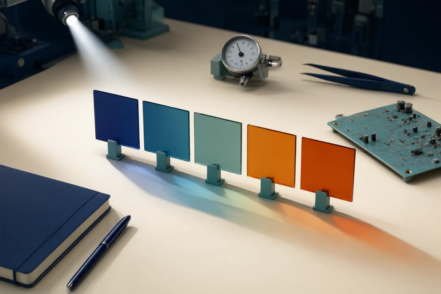
Hue rotation moves a color around the color wheel, but an equal numerical change does not always look equally strong. For more consistent palettes, isolate hue, keep saturation and lightness values steady during exploration, and judge each variation visually.
What Changes When You Rotate Hue?
Hue rotation changes a color’s position around a color wheel. The cited approaches perform this rotation while retaining the original saturation and lightness values, helping designers examine hue separately instead of changing several properties at once.
These properties describe different aspects of color. Hue identifies the color family, saturation describes intensity or mutedness, and tint is a hue mixed with white. Keeping those distinctions clear makes it easier to identify why an adjusted color looks different.
The wheel also provides useful reference points. A 180-degree rotation reaches the opposite position, while colors separated by 120 degrees occupy triadic positions. These numerical relationships describe positions on the wheel; they do not guarantee that the resulting colors will have identical visual impact.

Why Equal Hue Shifts Can Look Unequal
A hue angle is a useful control, but it is not a uniform measure of perceived change. According to the supplied source, equal numerical rotations can look different in size or strength because viewers do not perceive every portion of the hue wheel uniformly. It specifically contrasts shifts near yellow with shifts that pass through blue.
This explains why two colors with matching numerical saturation and lightness can still seem unequally bright or visually weighted. The numbers show that the same properties were held constant; they do not prove that the colors will look equally prominent. For that reason, a mathematically regular set of hue steps may still need visual evaluation before it functions as a balanced palette.

How to Build More Consistent Color Variations
Use a controlled process so that each comparison answers a clear question:
- Start with one palette color and record its hue, saturation, and lightness values.
- Rotate only the hue while retaining the starting saturation and lightness. This avoids the accidental multi-property changes that can occur with a general color picker.
- Use small hue shifts to explore neighboring variations. Use larger rotations when you want to investigate more pronounced palette changes.
- Compare the results visually instead of assuming that equal angle changes create equal perceived differences.
- If one variation appears brighter, heavier, or more prominent, adjust deliberately and document the change rather than treating numerical symmetry as the goal.
This approach is especially relevant when creating interface-state colors. The supplied example notes that manually chosen state colors can acquire inconsistent lightness or saturation. Isolating hue first creates a clearer baseline for comparison, while visual review addresses differences that matching values alone cannot resolve.
Conclusion
Hue rotation describes a numeric movement around the color wheel, while perceived color change describes what viewers actually see. Those two measures do not always align, even when saturation and lightness remain unchanged. Apply a controlled hue rotation to one palette color, compare the variations side by side, and make deliberate adjustments wherever equal numeric shifts fail to produce equal visual weight.
Disclosures and limitations
- This article was prepared with AI assistance from the supplied research package. Its factual boundaries reflect those sources, which cover hue rotation and perception rather than screen-to-print color-management workflows.
- No product is recommended or endorsed here, and the article contains no disclosed affiliate relationship.
Related reading
- Design & Media Guides for Clear Visual Communication
- Typography Choices That Make Long Screen Text Easier to Scan and Read
Sources
- Hue Shifter – Rotate a Color Around the Wheel — Toolexe
- Color Hue Shifter | Online Free Tool — elysiatools.com
- Hue Changer — Shift & Adjust Image Hue Online Free — Image Inverter
- Shift Hue of a Color | ToodleTools — toodletools.com